Developing a user-centred web strategy for an academic library
Strengthening the University of Greenwich Library's digital presence and making library resources and support easier to discover.
- Year
- 2026
- Role
- Library staff, independent project
- Focus
- UX strategy, web strategy, UX design
Overview
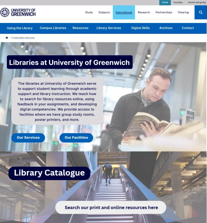
In summer 2026, the University of Greenwich was planning to redesign its public-facing library webpages as part of a broader university website project. As a library staff member, I independently conducted a navigation stress test, developed five user journey profiles, and evaluated relevant library websites and their homepage component designs. I developed a UX strategy using these findings, recommending how the library's content and services could be better organised in the redesign.
Problem
The University of Greenwich had accumulated library webpages across multiple internal and public-facing platforms, making its overall web presence difficult to navigate. Discussions about the redesign had primarily centred on current students, leaving a need to consider a wider range of users, including prospective students who may be unfamiliar with the institution.
Solution
My proposed solution addresses issues with navigation and content discovery through a local navigation typology and homepage design recommendations incorporating digital placemaking. I also recommend that the university audit its library content and consolidate as much as possible onto a single platform.
Website analysis and user needs
Navigation stress test
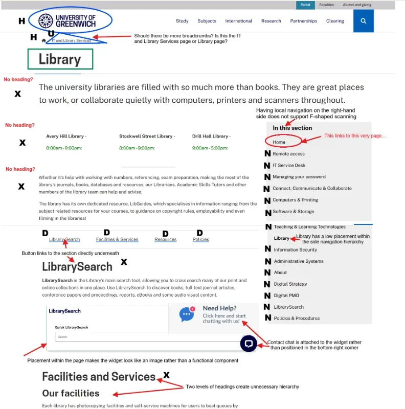
I conducted Keith Instone's Navigation Stress Test on the University of Greenwich Library homepage to evaluate its overall navigability. I identified issues including links directing users to external platforms, inconsistent headings and labelling, and repeated information across sections, contributing to a disjointed web presence.
User profiles
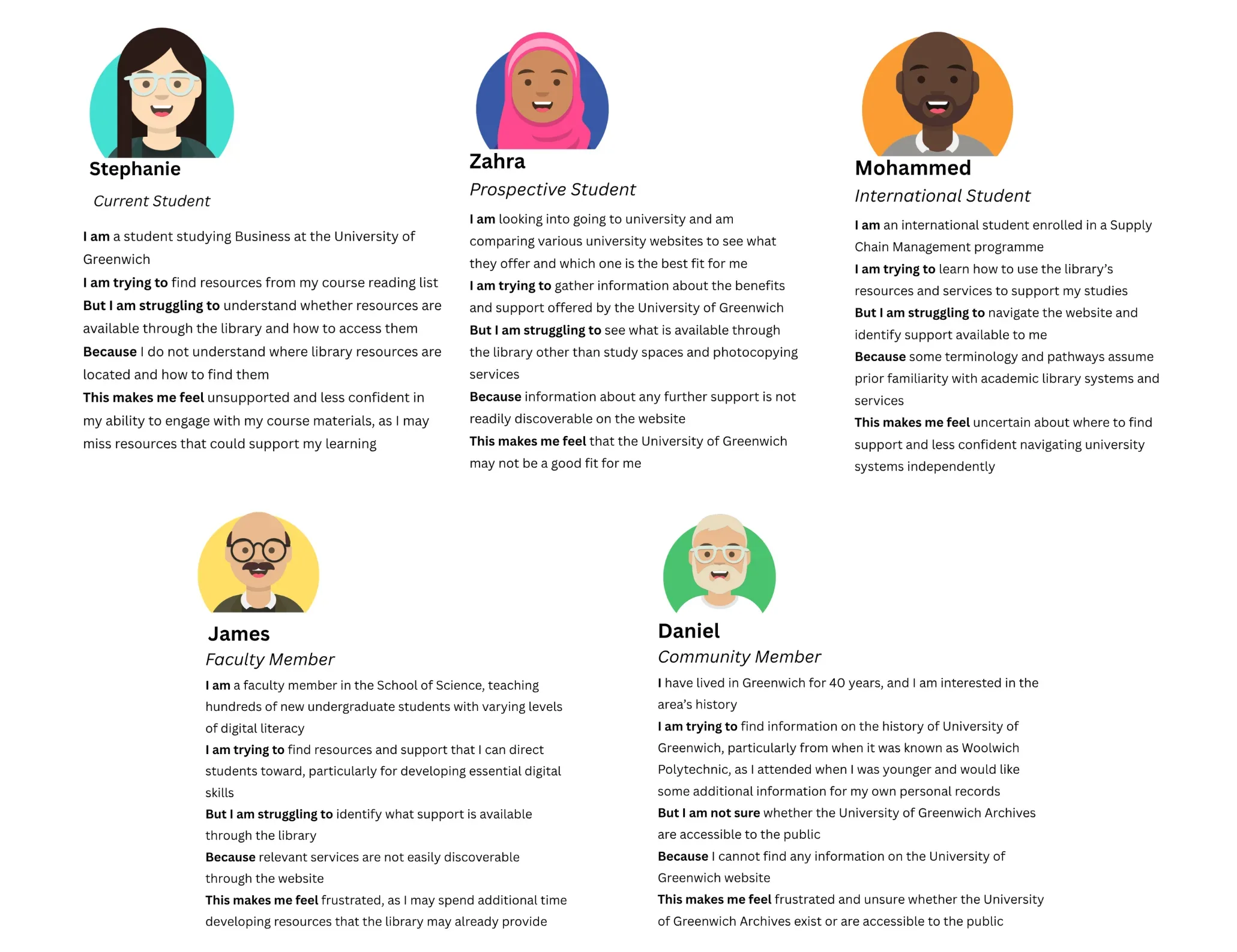
I created five user profiles representing potential user types to understand and convey different user needs for the library website redesign. These profiles drew on my experience working with faculty and students at the University of Greenwich, staff discussions about user needs, and experiences at other institutions. Full user profiles.
Comparative analysis
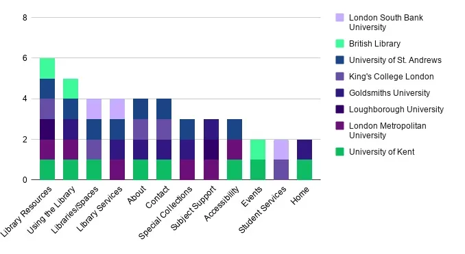
I evaluated 15 websites from comparable UK academic and higher education institutions, selected for their partnerships with the University of Greenwich, recommendations from colleagues, or as post-92 universities in Greater London.
Navigation typology
7 of the 15 had no distinct local navigation. Among the 8 with local navigation, the most common categories were Library Resources, Library Locations or Spaces, Using the Library, Library Services, About, Contact, and Special Collections.
Homepage elements
I compared how the library websites used six homepage elements.
- Digital placemakingUniversity of the Arts London
- Introductory textMiddlesex University
- SearchLoughborough, 14 of 15
- Library locationsCanterbury Christ Church
- Opening hoursGoldsmiths
- Grid layoutWest London, 14 of 15
Recommendations
Local navigation
A local navigation system to improve access to and discoverability of library services. The first four categories came from the typology analysis: Using the Library, Campus Libraries, Resources, and Library Services. Archives could attract external audiences and strengthen the university's identity. Digital Skills would make existing support easier to discover, and Contact adds a point of support.
Homepage design
I prioritised digital placemaking throughout the page, giving users visual cues about the physical library. Introductory text explains how the library supports learning, with calls to action, and a statistics section shows the scale of support available. I recommend a search function and grid layout, and highlighting each of the 3 campus libraries through local navigation rather than the homepage.
A Figma mockup shows how these recommendations work within the existing navigation and the university's visual brand guidelines.
Learnings
- Existing systems shape mental models Long-term stakeholders may see user needs through the lens of existing systems, rather than what a new experience could offer.
- Strategy can adapt to research constraints Combining comparative analysis, journey profiles and UX principles surfaced user needs without direct user research.
- Comparative analysis offers strategic value Similar websites revealed patterns I wouldn't have seen from the Greenwich website alone.
Next steps
- Audit content across platforms and consolidate onto the main website
- Build accessible content for different needs, such as English as a second language
- Test the recommendations with users and revisit assumptions
Read the full web presence report.